Zyeta's design for a peerless & collaborative workspace.
Logical thinking & artistic flourish for a global elevator firm's office.

The client: An esteemed Fortune 500 organization that is a prominent and global leader in elevator manufacturing
The client’s lead design center in Hyderabad required a symmetrical workplace necessary to offer a logical division between its various areas, at the same time ensuring a smooth workflow. These included the R&D Department with workstations and meeting rooms, among others. The design also featured a unique “Exhibit Space” meant to highlight and demonstrate company branding. The design center also had to maintain high standards of sustainability, specifically LEED benchmarks.

The design strategy: Generate symmetry, transparency, and an innovative showcase for the company
The design logically separated the service areas (namely, the lift and service blocks) and the central workspace. Increased emphasis on both allowed for a smooth and uninterrupted workflow. The service space also gave employees plenty of locations for collaboration.
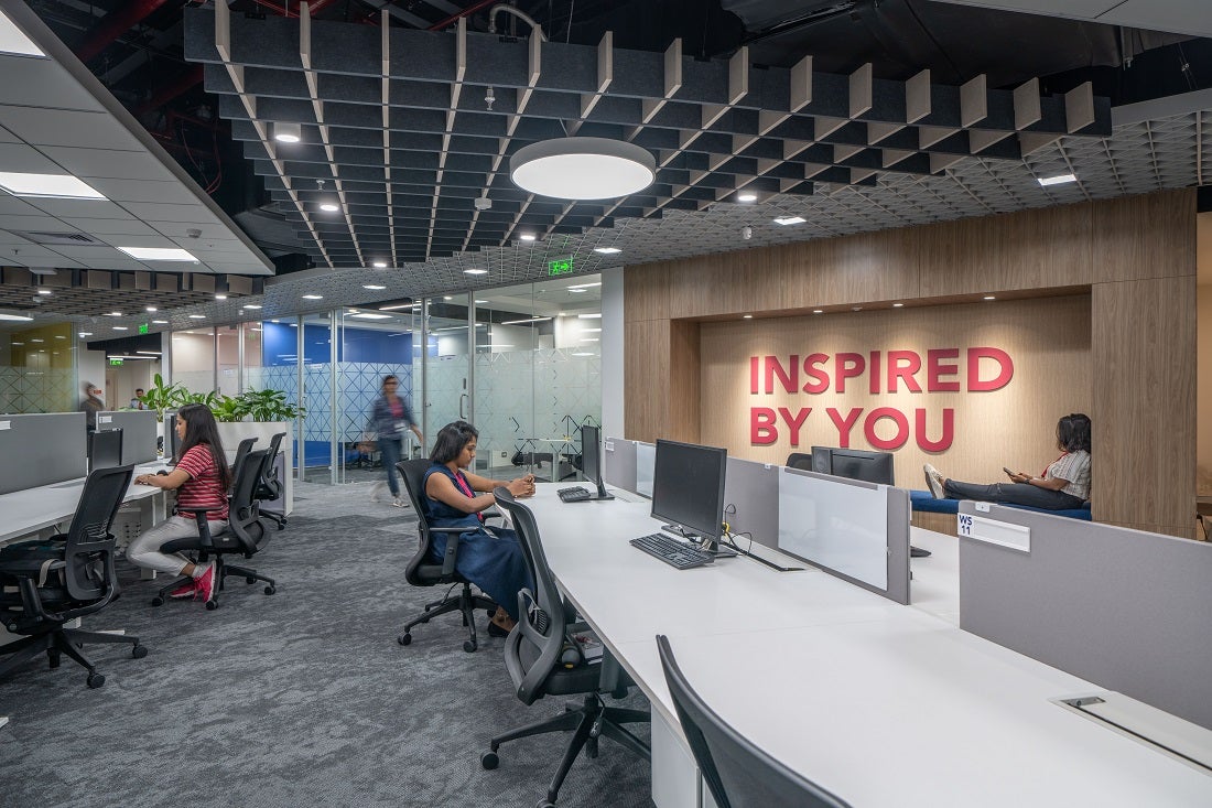
The R&D section of the floor - 500 SQM in general - offered a sleek minimalist design. This gave credibility to the mechanically innovative nature of the company. The exhibit space - on the other hand - offered a self-contained, multi-layered demonstration of the company’s brand and products. This consisted of a live-scale lift model, VR demonstration, and other impressive features.

Flooring blueprint: Giving prominence to each particular area, removing barriers and discrepancies
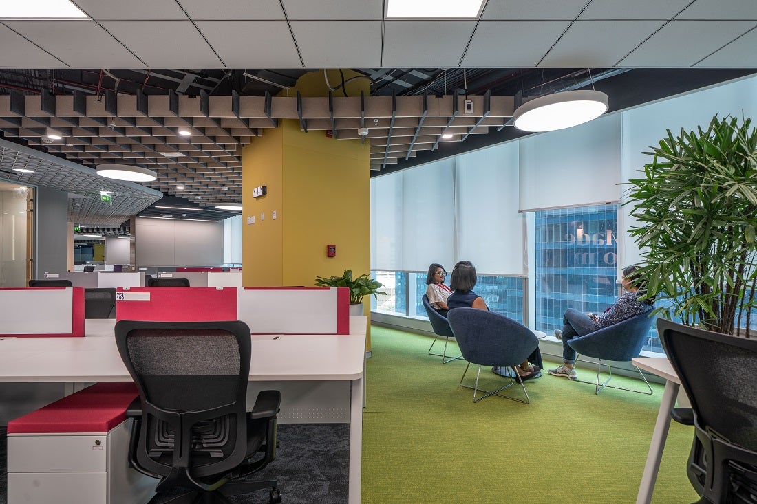
The floor area was complemented by the outstanding exterior view which brings plenty of natural light inside. Nearly 50% of the space is dedicated to the service area eliminating any possible service disruptions. Carpet tiles from Shaw Contract helped connect the various nodes in the design, including all the formal and informal spaces.
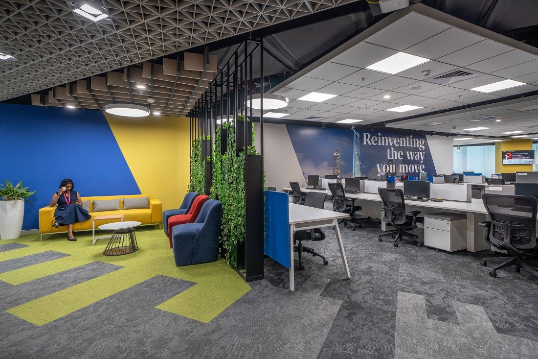
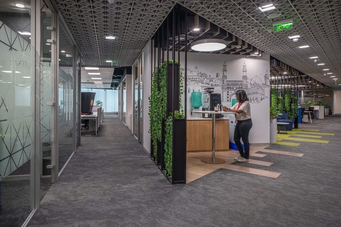
The scrum and huddle spaces, meanwhile, were defined by the accent carpet series which helped in highlighting the nodes and various function spaces. The flooring design of the corridors and various other common areas as defined by the plank carpet series. In themselves, the corridors were designed in a way that provided symmetry and direction for the people on each floor. A total of 15 meeting rooms gave more stability and balance to the floor.
The sustainable design reduces annual energy and water consumption by 20% and 40% respectively. It also features a 10-15% improvement in the overall ecological footprint.

Result: A state-of-the-art office that juxtaposes logical thinking and artistic flourishes
Creative minds can find balance and uniformity in the workplace as well. The branding colours and material palette served to further enhance the positive vibes. Overall, the smooth layout created a hierarchy-less atmosphere that encouraged collaboration and creativity.
“There is a sense of mindfulness in even the busiest corners of the office, and that makes it unique.”- Kishore Manoharan, Lead Designer, Zyeta.
December 15, 2020
 By using our site you accept our terms of use and privacy policy.